Beyond Airly: Building a School Air Quality Intelligence System
This morning, before my first class, I checked the air quality outside our school. Not in the Airly app. In my own report — built on live API data, updated automatically every hour, publicly available for parents and the local community.
CAQI: 26. Very good. PM2.5: 8 µg/m³. Temperature: 12°C. And right below the charts — a short paragraph written by Gemini. Every morning at 7:00 AM.
The Problem: Locked Data
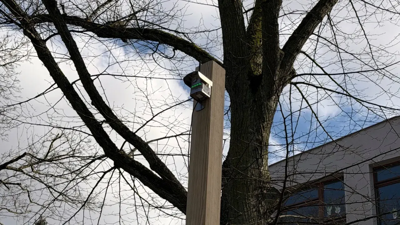
Our school — Prywatne Szkoły Leona Piwoni in Szczecin, a Google for Education Reference School — has an Airly sensor installed on the building. The data was available in Airly’s own panel, but it was “locked” there—without deeper analysis, filtering, or the ability to embed it organically on our school website.
I wanted more:
- Students to analyze real-world data in class.
- Parents to know exactly what their children are breathing.
- A Baseline for our Zielona Tarcza (Green Shield) project to see if our living wall actually improves air quality.
The Architecture: The One-Afternoon Stack
The solution didn’t require a massive budget. It took one afternoon and four components from the Google ecosystem:
1. Google Apps Script + Airly API
I wrote a few dozen lines of Apps Script that queries the Airly API every hour. It pulls PM1, PM2.5, PM10, temperature, and humidity, then saves them to a Google Sheet. A time-based trigger runs this 24/7. I don’t have to touch it.
2. Looker Studio (The Hidden Gem)
Looker Studio is Google’s free data visualization tool. In Poland, it’s mostly associated with marketing agencies, but it’s available for every school on Google Workspace for Education. I built a dashboard with:
- Trend charts for PM levels.
- CAQI level indicators in plain language (Very good / Moderate / High).
- WHO Standards comparison to give the numbers context.
3. Gemini API: Making Data Speak
I added one more function to the script. Every morning at 7:00 AM, Apps Script pulls the last 24 hours of data and sends it to Gemini.
Gemini analyzes the trends and writes a 4–6 sentence interpretation in plain Polish. It goes automatically from the spreadsheet into the Looker Studio dashboard.
No teacher needs to write it. No student needs to be a data scientist to understand if the air is safe today.
Why Looker Studio is the Future of EdTech
I’m writing this because Looker Studio is virtually unknown in Polish schools. Most institutions stop at Forms, Sheets, and Slides.
But Looker is one of the best tools for teaching Data Literacy. A student who can connect an API to a report and draw conclusions from a trend chart has a skill most adults lack. We started with air, but this works for:
- Weather station data.
- School attendance trends.
- Energy consumption in the building.
- Student survey results.
What’s Next?
The report is now public. When our Green Shield living wall is planted, we will have a ready-made research project. Students will use real data to prove or disprove a hypothesis about urban greenery.
I’m writing this from Dublin, attending the Google for Education Reference School Program Summit. If you work in education or EdTech, I’d love to connect and share the scripts.
Check the live panel here: Looker Studio Report
🛠️ Tech Stack used in this project:
- Language: Google Apps Script (JavaScript based)
- Data Source: Airly API
- Storage: Google Sheets
- Intelligence: Gemini API (Flash 1.5)
- Visualization: Looker Studio